
In the constantly changing digital landscape of 2025, having a website is not sufficient anymore — it must be responsive, speedy, and mobile-friendly. With customers accessing the internet from a vast range of devices — from smartphones and tablets to desktops and even smart TVs — your website needs to respond and look great on all screen sizes seamlessly.
Responsive web design is not a trend. It’s a necessity for any business that wants to stay relevant, competitive, and accessible in the modern digital world. Whether you’re a startup, a large enterprise, or an ecommerce brand, a responsive website directly impacts your traffic, user experience, search rankings, and ultimately, your revenue.
In this article, we discuss why a responsive website is more crucial than ever in 2025 — and how working with specialists like Webvizion Global, a leading website design agency in the UK, can assist you in building a high-performing, future-proof online presence.
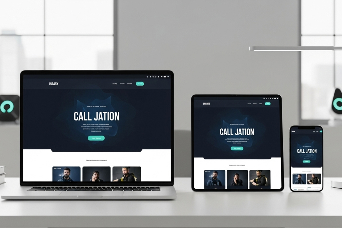
What is a Responsive Website?
A responsive website is made to adapt automatically its layout, images, text, and functionality in relation to the device or screen size on which it’s being displayed. No matter if someone views your site on a 6-inch phone or a 27-inch screen, the content will adjust to ensure an optimal view and interaction experience.
Responsive design entails:
- Flexible grids and layouts
- Media queries
- Scalable images and typography
- Mobile-first design principles
The goal is simple: create one website that works for everyone, everywhere.
Why Responsive Design is Crucial in 2025
1. Mobile Usage Dominates Web Traffic
By 2025, more than 75% of global website traffic will come from mobile devices. Users expect fast, intuitive, and engaging experiences on the go. If your site isn’t mobile-friendly, you’re missing out on a massive portion of potential customers.
A non-responsive website leads to:
- High bounce rates
- Poor engagement
- Missed conversions
Conversely, a responsive website keeps users longer, more engaged, and performing desired actions such as filling out forms or buying.
2. Google is Mobile-First Indexed
Google now indexes your site mainly according to how it functions on mobile, not desktop. This mobile-first indexing means your site’s mobile usability directly affects your SEO rankings.
Key SEO advantages of having a responsive site:
- Faster page load times
- Improved user experience
- Better Core Web Vitals scores
- Decreased bounce rates
- Increased dwell time
If your site isn’t mobile-friendly in 2025, it may vanish from search results, regardless of how good your content is.
3. Enhanced User Experience (UX)
Excellent design is about more than aesthetics — it’s about usability. A responsive site provides a smooth, consistent user experience no matter the device, making it simpler for visitors to:
- Read the text without zooming
- Use menus and buttons
- View and engage with media
- Make buys or fill out forms
Great UX equals increased satisfaction, trust, and conversions. In 2025, user experience is not an extravagance — it’s a differentiator.
4. Improved Conversion Rates
A site that is responsive to mobile devices minimizes friction in the user experience. Whether the user is subscribing to your newsletter or checking out with an overflowing cart, your site must work smoothly on every device.
With mobile shopping at an all-time high, responsive ecommerce sites experience:
- Higher conversion rates
- Increased average order values
- Lower cart abandonment
If your checkout buttons are broken on mobile, you’re leaving money on the table.
5. Lower Maintenance and Cost Efficiency
Before responsive design, businesses used to create separate desktop and mobile websites, doubling the development effort and ongoing maintenance costs.
With a responsive design:
- You manage one site instead of two
- Updates are done once, and work on all devices
- It’s simpler to scale and introduce new features
- You save time and money in the long run
One responsive site is much cheaper than having to maintain multiple versions.
6. Future-Proof Your Business
With the introduction of new screen types — foldable phones, smartwatches, in-car browsing, and so on — your site needs to be flexible enough to accommodate unknown future technology.
A responsive design is also super flexible and will ensure that your site looks great on whatever screen size or device is next.
Why Choose Webvizion Global for Responsive Web Design?
In responsive web development in the UK, Webvizion Global is a household name.
Who Is Webvizion Global?
Webvizion Global is a leading UK website design agency of 15+ years of experience creating high-quality, mobile-friendly websites for businesses of all sizes. From small startups to global brands, Webvizion has assisted hundreds of customers in enhancing their online presence, enhancing user interaction, and driving more conversions.
Services offered:
- Custom website development
- Responsive web development
- Ecommerce website development
- UI/UX design
- Search engine optimization -friendly architecture
- Upgrades and maintenance of websites
Why choose Webvizion?
- Mobile-first design: All sites are crafted with mobile visitors foremost in mind.
- SEO-friendly layout: We construct sites to rank well in Google search results.
- Quick loading times: Conversions and user retention depend on speed.
- Cross-browser support: Your site appears wonderful on Chrome, Safari, Firefox, and beyond.
- Custom solutions: If you’re a law firm, fashion brand, or restaurant, Webvizion constructs to your image.
Signs You Need a Responsive Website in 2025
Not certain if your existing website requires a responsive update? Watch out for these indicators:
- Your website appears to be distorted or cropped on mobile phones
- Buttons or menus do not respond on tablets
- Heavy mobile bounce rate on Google Analytics
- People complain they can’t easily navigate your website
- You maintain two distinct mobile and desktop websites
- Your SEO rankings have decreased substantially
If any of these sound familiar, it’s time to reimagine your site with responsive design best practices — and Webvizion Global can assist.
Final Thoughts
In 2025, responsive design is no longer a nicety — it’s a necessity. It affects every facet of your digital success, from search engine optimization and brand reputation to usability and revenue.
A responsive website benefits you:
- Gain more users across devices
- Enhance search engine visibility
- Provide improved customer experiences
- Boost conversions and ROI
- Future-proof your digital presence
Whatever you’re creating, it’s a good idea to start with mobile responsiveness.
Webvizion Global, with 15+ years of experience, is your go-to partner to get your website up to date. Their skilled team brings together design, development, and strategy to create websites that don’t only look great — they perform beautifully too.
Ready to level up your website for 2025?
Contact Webvizion to begin working with the UK’s reliable responsive web design agency.
Let Webvizion Global assist you in creating a mobile-friendly, SEO-dedicated, and conversion-driven website that yields tangible results.